Deora
BRAND IDENTITY DESIGN
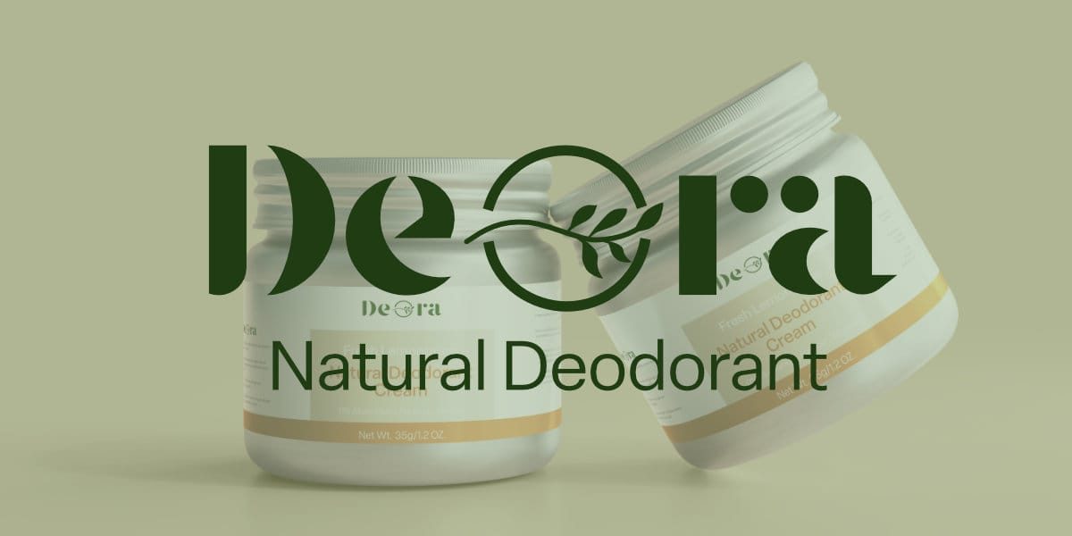
About Deora
Say hello to freshness, straight from the earth. Deora is a gentle yet powerful deodorant cream crafted with mineral-rich kaolin clay, a natural resource known for its ability to absorb odors and toxins without harming your skin—or the planet. Blended with nourishing plant oils and pure essential oils, Deora keeps you confidently fresh all day, without aluminum, synthetic fragrances, or harsh chemicals.
Deora Design Needs
To strengthen their brand image and better connect with their target audience, they need several key design elements, including: Logo, Color Palette, Typography, and Packaging Design.
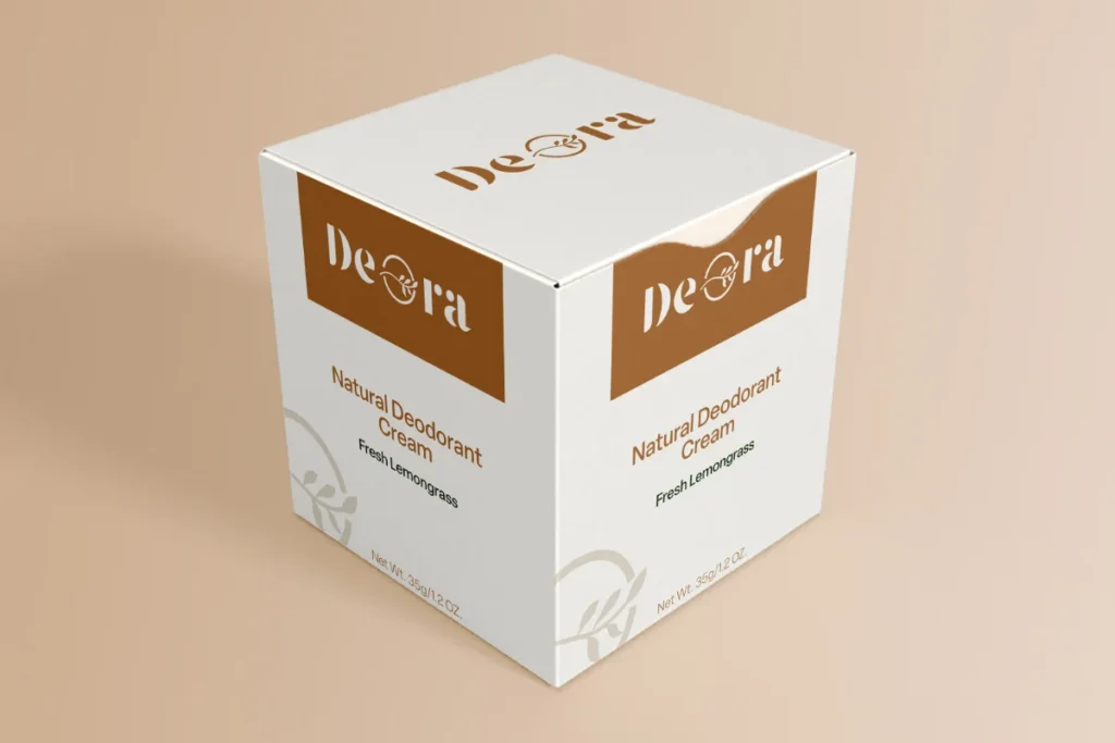
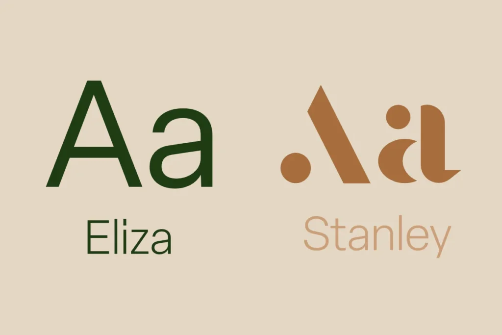
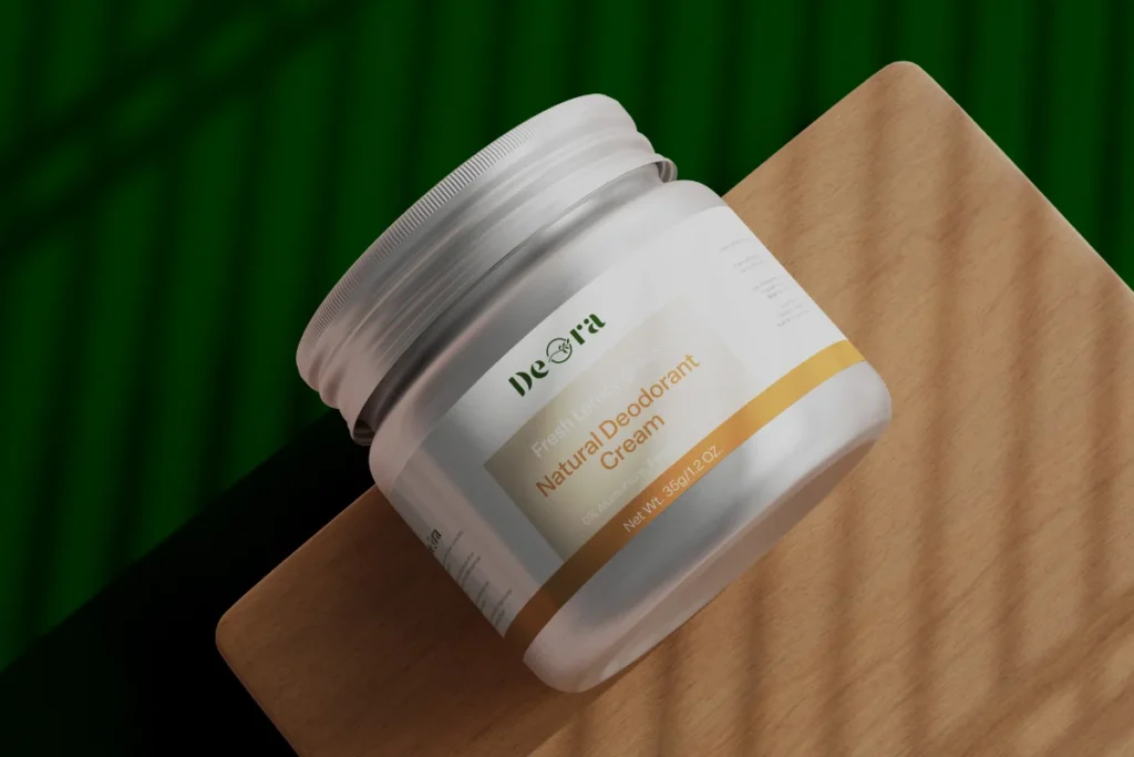
They want the brand identity to feel fresh, clean, and connected to nature, avoiding overly clinical or artificial aesthetics. The goal is to create a brand that consumers trust and love, making Deora their go-to natural deodorant.
Our approach for logo design is integrated of the leaf within the “O”. It symbolizes nature and freshness in a subtle yet effective way. The bold serif typeface adds a premium feel while remaining approachable.
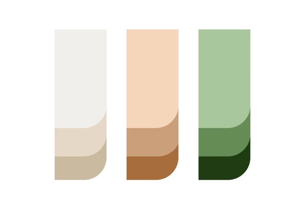
Color palette choices with earthy browns, beiges, and deep greens beautifully reflect nature, organic ingredients, and sustainability. The combination is well-balanced and harmonious.
