KIMI Cakes & Co

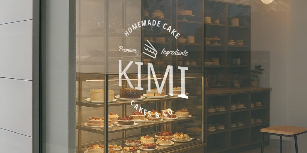
KIMI Cakes & Co BRAND IDENTITY DESIGN About KIMI Cakes & Co KIMI Cakes and Co. is a homemade cake brand from Japan, dedicated to crafting authentic, mouthwatering desserts like Tiramisu and Chiffon Cake. With a commitment to using only Halal-certified ingredients, KIMI Cakes and Co. ensures that the Muslim community can indulge in traditional Japanese flavors with confidence and peace of mind—enjoying every bite without compromising their faith. KIMI Cakes & Co Design Needs Logo Logo System Color System Instagram Feed & Reels Content Thank You Card Invoice Template KIMI Cakes & Co Logo Design The owner of this brand wanted the logo to appear classic and timeless, while still maintaining a minimalist feel. For the color palette, they requested the use of pastel tones to make KIMI Cakes & Co. look warm and approachable to its target audience. After a process of sketching and brainstorming, we proposed a logo design in the form of an emblem, featuring a subtle cake illustration and a typeface that is classic yet not overly rigid. We paired the logo with a combination of soft and deep pastel green tones to enhance its friendly and inviting appeal. KIMI Cakes & Co Visual Branding
Deora Natural Deodorant

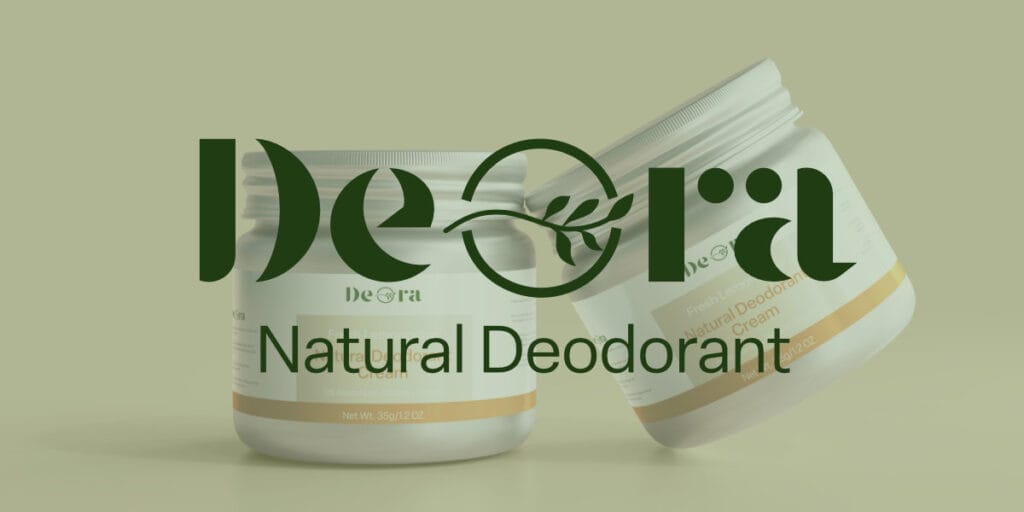
Deora BRAND IDENTITY DESIGN About Deora Say hello to freshness, straight from the earth. Deora is a gentle yet powerful deodorant cream crafted with mineral-rich kaolin clay, a natural resource known for its ability to absorb odors and toxins without harming your skin—or the planet. Blended with nourishing plant oils and pure essential oils, Deora keeps you confidently fresh all day, without aluminum, synthetic fragrances, or harsh chemicals. Deora Design Needs To strengthen their brand image and better connect with their target audience, they need several key design elements, including: Logo, Color Palette, Typography, and Packaging Design. They want the brand identity to feel fresh, clean, and connected to nature, avoiding overly clinical or artificial aesthetics. The goal is to create a brand that consumers trust and love, making Deora their go-to natural deodorant. Our approach for logo design is integrated of the leaf within the “O”. It symbolizes nature and freshness in a subtle yet effective way. The bold serif typeface adds a premium feel while remaining approachable. Color palette choices with earthy browns, beiges, and deep greens beautifully reflect nature, organic ingredients, and sustainability. The combination is well-balanced and harmonious.
Orugunaizu by JT

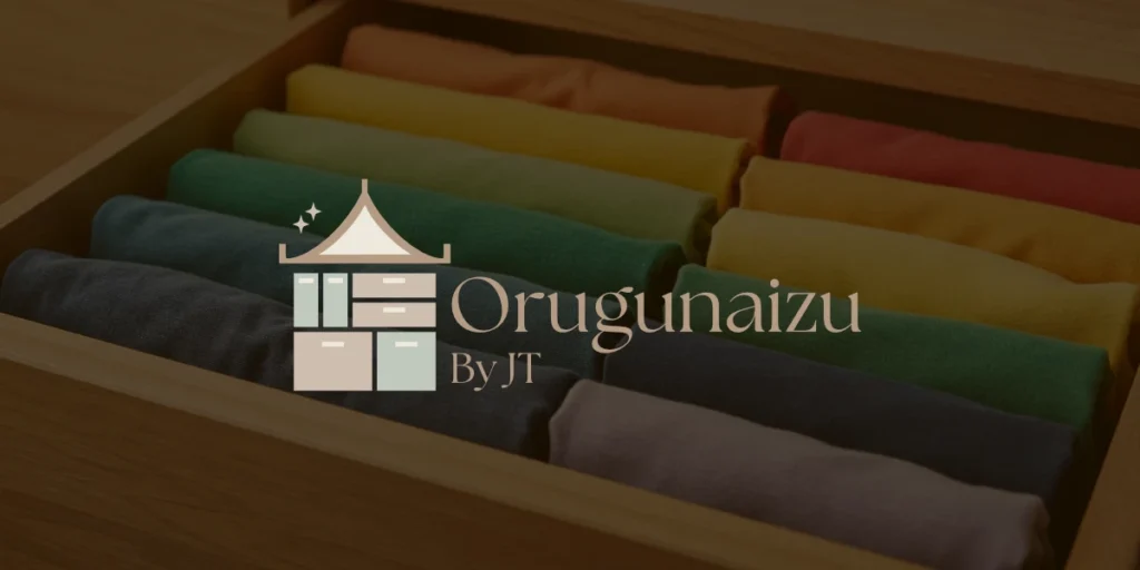
Orugunaizu by JT BRAND IDENTITY DESIGN About Orugunaizu by JT ORUGUNAIZU By JT is a home organizing service inspired by Marie Kondo’s KonMari™ method, helping clients create meaningful connections with their belongings. Designed for men and women aged 17 to 60, it offers medium-priced services that turn cluttered spaces into calm, organized homes. With a minimalist, modern style and a touch of Japanese culture, the brand promotes peace of mind through tidiness, proving that a neat space leads to a more joyful life. Orugunaizu by JT Design Needs: To support their business image and align it better with their target customers, they require several design elements, including: Logo, Typography, Brand Guidelines, Letterhead, Business Cards, Uniforms, ID Cards, and Custom Social Media Icons. According to the logo design brief, we began the ideation process by creating multiple sketches to explore different concepts before finalizing the approved design. The logo consists of three key elements, each thoughtfully chosen to reflect the brand’s identity and philosophy. Logo Possibilities Visual Branding
